

Standard Deviations vol. 5: A look back at Marvel’s “70th Anniversary” variants
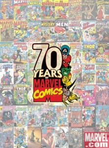
 Two weeks ago we took a look at 2011’s Marvel Comics’ 50th Anniversary homage variants and I couldn’t help but mention 2009’s “70th Anniversary” set. You read those numbers correctly: 70th anniversary in 2009, 50th anniversary in 2011. Using an “any excuse for a celebration” approach, the publisher decided to cobble together its history as Marvel (dating back to 1961), Atlas (operating from 1951 to 1957), and Timely (operating from 1939 to 1950) and whether you love or hate the decision, it led to some beautiful cover art from Marko Djurjevic.
The “Make Mine ’39” 70th anniversary employed the same kind of aggregate math that’s been used in recent years to publish milestone issues like The Amazing Spider-Man #600, The Incredible Hulk #600, as well as last month’s 300th issue of Wolverine. It’s a convenient approach to add back some sense of history after renumbering those books to get a new #1 issue on the shelves. I generally dislike renumbering a series (especially when it hit close to home with the restart of Uncanny X-Men), but the similarities to acknowledging their pre-Marvel history by cobbling things together ends at the arithmetic.
Our look at the 70th anniversary variant covers that were part of the celebration originally came in three installments back at the dawn of MLD (found in parts one, two and three), but who wants to look in three places? As there was no formal set of Standard Deviations posts at the time, it seemed like it was worth revisiting now. We’ve updated the gallery below from the promotional images to the final images with logos and trade dress that reflects they way these books looked on the few shelves they seemed to make it to. I really love the focus on individual characters and adding their names and dates of “establishment” at the bottom of each cover was a nice touch.
 I also appreciated the fact that many of the characters featured appeared on the covers of issues of their own titles. However, in the cases where the character appears on a series they’re not normally associated with the logo really stands out. Thor on the cover of The Incredible Hercules is probably the most glaring. The logo is rather cartoonish and despite both characters having roots in cultural mythology, seeing Hercules’ name floating there with Thor just looks wrong. Plus it’s one of two instances here where the logo is in the foreground and that’s just not a design choice I can get behind. I realize Marvel wasn’t publishing a Thor title at the time these shipped, but that cover may have been better suited on another title (Avengers, maybe?). Namor on the cover of Black Panther isn’t much better, and I certainly would have preferred to see Black Panther actually appear there. The original Human Torch on the cover of Captain America (which actually has two issues in the set that happen to come before and after an anniversary renumbering) gets a pass since the characters not only have a history together, but I believe the Torch actually appears in the issue that features him.
This set represents only a handful of the gorgeous cover artwork Marko Djurdjevic has done for Marvel over the years, but I think these are some of his most striking images (along with his ultra-wide interlocking X-Men variant cover set, of course). It’s too bad that these books weren’t more visible in comic shops as they were being published, especially since I believe there were 1:10 variants and were priced between $5 and $10. It seemed that many stores just didn’t have them on hand and that was attributed to Marvel’s minimum ordering system to allocate the books. It’s also disappointing we’re not likely to see more Marvel work from Djurdjevic anytime soon after his very public departure from the company last summer.
Be sure to check out Marvel’s 70th anniversary frame variants here and here, well as a nice looking set of similar DC covers from January 2011 that were readily available on the regular editions of their entire line.


