

REVIEW: Secret #1
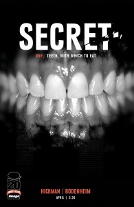
 New from writer Jonathan Hickman and artist Ryan Bodenheim is Secret, a series that aims to combine industrial espionage with political conspiracy. Though I’m glad I read its first installment, the book left me somewhat underwhelmed. Admittedly, Secret #1 was my first introduction to Hickman’s writing. Given the high level of praise he receives on various comic book forums across the internet, my expectations were rather elevated.
On the one hand, Secret is a story that should be told. The history of industrial espionage dates as far back as the history of industry (see Pinkertons). Some corporations have risen to a level of economic power that rivals nation states (e.g., compare Wal-Mart’s annual revenue [$421.849 billion] to the Gross Domestic Product of, say, Denmark [$310.760 billion]). Hickman wisely focuses on both legal and accounting firms, as these fields, in addition to finance and insurance, hold ubiquitous positions within the global political economy’s core countries. The material is incredibly timely and socially pertinent. Throwing in a James Bond element certainly adds entertainment value to the social commentary.
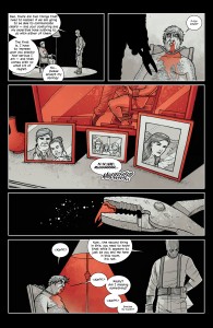
On the other hand, it’s a shame the story was so unintersting visually. In violation of the “show, don’t tell” principle, most of the pages are dedicated to talking heads in suits in or around a corporate office building. The character designs are all relatively uniform: they all wear suits with minor variations (necktie, no tie, or bow tie; vest or no vest; jacket buttoned or unbuttoned), they are all aged between mid-30s and mid-60s, there are only two women (one of which appears in just two panels), and all of the characters are white. While these character designs do capture the setting perfectly and fit the story quite well, as a reader it’s rather difficult to distinguish one character from another during a first passing through the book. This issue of uniformity was compounded by the book’s coloring, which could best be described as using one to two monochromatic pastel palettes to shade the entirety of a panel or page. The coloring style prevents readers from using some visual aids, like tie color and skin pigment, to distinguish one character from the next.
 Though generally dull from a narrative standpoint, Bodenheim’s line art was attractive and it did shine memorably during two key segments: the opening kidnapping scene and a flashback documenting a corporate break-in. It’s quite possible that Hickman’s source material for the first issue was not conducive to visually interesting sequences; after all, is it even possible to illustrate the process of embezzling funds to an offshore banking account, or even draw a boardroom, in an interesting manner? One can hope the sequential art will portray a better visual narrative in future installments of Secret.
While the issue certainly packed a considerable amount of story into this issue, given the visual limitations Secret seems like it would read better as a prose book than a comic. I hope that future issues will rely more upon meaningful visual sequences and less upon boardroom exposition.
Read more about Image Comics on MyLatestDistraction.


